UI-phemism
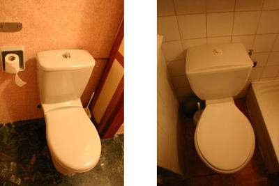
First off... Yes I took pictures of two toilets. These two beauties come from Bologna, Italy and came from two hotels. The interesting thing is that beyond the obvious interaction model they have similar looking but exactly opposite flushing mechanisms.
The first uses a push button mechanism while the second uses a pull mechanism. Just looking at them it's hard to tell the two apart. I call this a UI-phemism. Similar UI but different interaction models. Another example by Donald Norman is a door that looks the same for pulling as it does for pushing.
I sometimes see the same thing in computer interfaces. For example a scrollbar that instead of scrolling content is used as a slider control. Another example is using a checkbox control instead of a multiple choice radio button.
Consistency and predictability help people quickly learn new devices and transfer knowledge between similar devices. There is no rule that says that the gas pedal is on the right and the break is on the left however all cars recognize that this consistency is important.
Interestingly there is a "correct" choice for the bathroom problem. When possible the interface interaction should match the action you are trying to perform. In this case you want things to go down and away. Pulling up to flush is very disconcerting.
Comments powered by Disqus.