How to design bad site for a great brand
Take one world-class brand: Coca-Cola. Now imagine a truly awful website. This is probably one of the worst sites for a global brand that I've ever seen. Here's a quick breakdown:
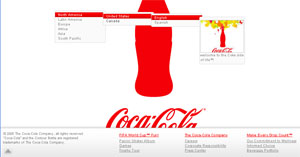
- Don't chop your logo in half. This seems obvious yet on the home page the Coca-Cola logo is cut in half. For any users with 800x600 resolution the bottle is cut in half as well.
- Don't use cascading drop-down menus. These are hard to use and if your mouse slips off the menu goes away and you have to start over. Amazingly the site does seem accessible although it appears to have taken a ton of JavaScript. Why not just provide links to these other sites? (See Craigslist) Once the choice is made perhaps the site could remember this for my next visit? Remember how links can turn purple once visited? That's a nice feature of Web 1.0.
- Don't use a full screen pop-up for your primary screen design
- You can't bookmark a pop-up
- You can't forward a pop-up to a friend or copy the URL into an email
- You can't print the page
- You can't navigate (back/forward)
- Don't use flash as a primary site element. Flash is a great tool for developing and designing applications and animated page elements but it's not great for everything. I ended up on some video site that as far as I could tell had nothing to do with Coca-Cola products.
- If you do decide to use flash make sure you use a loading graphic so users aren't staring at a white screen wondering what happened.
- Provide some basic top-level navigation for your site. ( Products, Corporate Information, Ads, Company History, Press, Shopping, Etc. )
- Provide a site search on your home-page in a clearly marked area.
- Don't use a pop-up for your site map. If you do have a site-map mark it with the words site-map, not just an icon.
- Once I closed the flash graphic there's no way to get back to it. Poof, and the page navigates to a 'thank-you' page.
Interestingly if you happen to find the hidden link at the bottom of the page you can get to a site that does a better job of giving visitors the information they need. This hidden site is rich with information, search, links etc. It has it's own set of problems but is leaps beyond the current home page design. The current flash design certainly has some graphical appeal but it sacrifices content and functionality.
This post is licensed under
CC BY 4.0
by the author.
Comments powered by Disqus.