Windows XP Service pack 2 includes more than bug fixes. This service pack has a number of new concepts, and UI changes that users should be aware of. Some of the changes are aesthetic and some are functional. With this service pack Microsoft has taken a harder stance on security and although this may go some distance to appease the harsh security critics some of these changes may prevent non-technical users from completing common internet tasks.
The review will cover UI concepts, the good, bad and ugly.
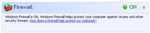
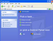
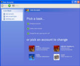
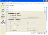
![]() XP security center
XP security center
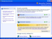
The XP security center UI is a launch point user interface. The concept is good... Provide a central place to deal with security information.
Unfortunately the security center falls short. The software only allow you to turn on certain features but falls short of providing a complete solution for novice users.
A simple example is the XP Firewall. Once the software is turned on there is no obvious way from the security center to make adjustments. The one link in the main dialog brings up a help dialog, not firewall UI.
To actually make any changes the user must click on a separate icon labeled:
![]()
This opens up a separate dialog that has additional settings to block or allow certain types of internet traffic:
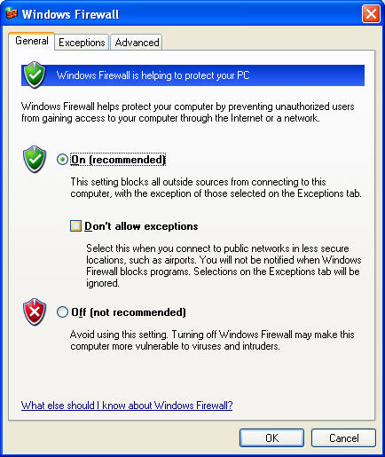
The exceptions tab allows you to add exceptions but this is rather difficult. The most likely way that users will create exceptions through the firewall is using the dialog that comes up when an actual programs tries to connect to the internet:
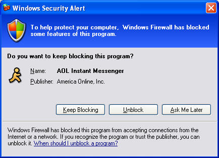
From my experiments the firewall takes the program name and publisher directly from the executable. This means that a rouge program could easily trick the firewall with a non-legitimate publisher and program name. Since the program does not prevent this type of attack the firewall will mostly be an annoyance to users. Additionally this is likely to prevent many internet enabled games from working correctly since the UI can not be seen when a full screen game is running.
Loosing Control
Microsoft continues to have trouble picking a control panel style and stick with it.
 |
 |
 |
 |
| A top level control panel | Second level control panel, now done inside the control panel framework, follows the same look as the top level (Good) |
Third level control panel pops out in it's own window using a different look, no menus or address bar, still mostly similar. |
A new second level control panel that links off to security related dialogs has it's own style. This also opens in it's own window |
 |
 |
 |
 |
| New Wireless Control Panel has it's own style. | The add and remove control panel also uses parts of this style but does it's own thing. |
Internet Firewall Dialog using the traditional dialog with a new blue banner, just because.. |
... and of course the Control panel that's also a folder. |
All the new control panels have their own visual style. Security center, new wireless UI, firewall dialog.
It should be noted that many of these dialogs have been modified specifically for the release of SP2, they could have been modified to follow the same style.
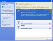
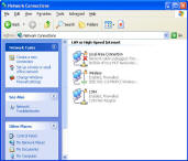
Wireless UI
Over the last 4 years the use of wireless devices has exploded and it's fairly easy to find at least one wireless connection when standing on a corner of a most city blocks. So I was excited about the new wireless UI.


Unfortunately it's a real mess. Pre-SP2 there was one dialog and even though it wasn't ideal it was a single location to configure wireless settings. In SP2 there is a new dialog and wizard that aim to configure and setup your settings. The new UI is somewhat simpler but because it only does part of the job you still need to deal with the previous UI confusing things even further. In addition the "Wireless Network Setup Wizard" is separate from the "Home Network Wizard" as a user trying to install a wireless network it would be confusing as to what wizard I should use. The new functionality should have been integrated into the pre-existing
interface.
Internet Explorer - Punishing many for the mistakes of a few.
Our poor users want to install a program from a popular site....
![]()
The first hurdle is getting the file. The website designer wanted to make this easy by re-directing to the executable but IE prevents this and doesn't offer an over-ride that I could find. Strike One.
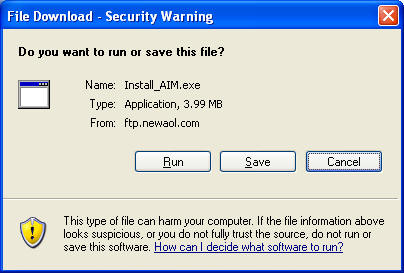
User sees a security dialog. This dialog is fairly clear in the possible actions but would certainly frighten any in-experienced users. Strike two.

After that internet explorer goes a little far once again warning you about the dangers of internet software. Strike three. I should only be warned once. Imagine if other parts of the interface where this pedantic? Are you sure you want to open your email? If you open your email you may read something you don't want to know, are you sure? Do you really want to
read email?
Explorer
The task area in Windows Xp was designed to promote high level tasks and minimize confusion. All tasks that appear in Windows XP are useful to a large majority of users. In SP2 we've added some confusion.
There is now the distinction between a home network and a wireless home network. I mention this in the wireless area and this is almost certainly going to cause problems as many home networks that have wireless are a combination of wired and wireless and it's not clear that the two have different sets of functionality. With some better planning this should have been one wizard that would walk you through the setup regardless of how your PC is wired.
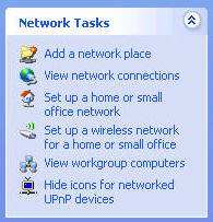
Secondly there is a new item called "Hide icons for networked UPnP devices." This is terrible task for several reasons. First off it's not something that most users need to do since most users don't know what a UPnP device is. In fact most users don't have any devices to hide so the task is totally useless. Additionally the task is phrased in programming terms and does not address the real problem, what the user wants is to reduce the clutter in their network folder.
Useless Dialogs
The term "Dialog" is meant to describe it's purpose. A dialog is supposed to ask a question, take some input and process the results. The following dialog is an example of poor UI design.
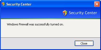
There are already mechanisms to tell you if the firewall is on:
![]()
Therefore the message box is entirely useless. The dialog could equally be shown like this:
Conclusion
My main gripe about security is that it's often viewed as just a way to
'secure your computer.' Keeping undesirable users out is just half the
problem. Security is useless if the the people who should have access can't
get to the resources. Well designed security not only keeps intruders
out but it provides mechanisms to let others in.
Typical message box: "Your password is wrong. Ok."
Better dialog box: "Your password is wrong. Would you like to try
again, request the owner for permissions or cancel?"
Microsoft has made a good push for security but at the cost of the user
experience.
Service pack 2 may make your computer more secure but it is also likely to
cause you annoyance and frustration. Security can be added without
hurting the user experience.
##################
Raizlabs was founded in 1997 by Gregory Raiz, with a vision to enable
people to express their creativity and imagination through innovative
software and products. As a leader in user interface design for websites and
desktop applications Raizlabs continues to provide software and web
solutions worldwide.
Gregory Raiz formerly worked at Microsoft on the design of Windows XP but
was not involvement in the design of Service pack 2. Companies seeking
guidance in user interface design are directed to the services section of
this website.